Account Metrics
A guide to understanding your Account Metrics and their impact on your business.
The Account Metrics provide you with valuable insights into how the organization spends its time, and breaks down how time is spent across your tech stack and the associated cost for the business as a whole and by team (based on Shared Workspaces).
Table of Contents
How It Works?
The Account Metrics are available to Owners, Admins, and Report Users will get aggregated insights (deliberately protecting individual privacy to avoid employee monitoring). The Account Metrics will encompass eight essential aspects: Account Summary, Meetings, Calls, Sentiment, Working Hours, Apps, App Categories, and Challenges.
Where To Find Your Account Metrics
- Log into your Produce8 Account.
- Go to your Account Metrics page by navigating to your sidebar navigation and selecting Account Metrics. By default you will land on the Summary page.

- On the Summary page, locate the gear icon, and click on it to access the Settings.

- Within the settings, you'll have the option to input the average cost per user. Enter the appropriate value to ensure accurate cost calculations.
- Select Save to apply the changes.
- After saving, use the sidebar menu to explore detailed metrics pages, such as Meetings, Calls, Sentiment, Working Hours, Apps, App Categories, and Challenges.
Navigating Your Account Metrics
Each of the metrics provide additional context to help you understand how time is spent. All of these metrics can be aggregated daily, weekly, or monthly by selecting the date range on the calendar.

Account Metrics Summary
When accessing Account Metrics, you will land on the Summary page by default. This page provides a comprehensive high-level overview of your organization’s key metrics, including:
- Scheduled Time in Meetings: Aggregate time spent in internal and external meetings organization-wide.
- Time in Calls: Total time spent on calls across platforms such as Slack, Microsoft Teams, and Zoom.
- Average Sentiment: Average sentiment score across all users in the organization.
- Average Working Hours: Insights into the average working hours of all users within your organization.
- Top Apps:
- Users: The number of users interacting with each app in the selected timeframe.
- Views: The number of interactions with each app.
- Change: Comparisons of app usage to the previous reporting period.
- Cost: The potential financial impact of app usage, calculated by multiplying views by multiplying views by the average rate.
- Top Categories: View a breakdown of time spent across different categories to better understand how time is distributed across your organization.
Each of these summary components serves as a gateway to deeper analysis. By clicking on any section, you can explore detailed reports and uncover insights specific to meetings, calls, sentiment, working hours, apps, and challenges.

Meetings
Understand the time spent in internal and external meetings across your business, including the nature of the meetings and their implied cost.
On the Meetings page, you'll find:
-
Meeting Costs
- A donut chart showing the distribution of time in external and internal meetings.
- Total costs based on organization's cost settings.
- Increase/decrease in meeting time compared to the previous period.
- A trend chart displaying all calls over the previous three months, available for weekly and monthly data.

- Meeting per Person
- Average time spent in meetings per person.
- Average number of meetings attended per person.
- Meetings by Size
- Distribution of meetings based on the number of people for the selected timeframe.
- Changes in meeting duration and cost compared to the previous period.

- Meetings per Workspace
- Breakdown of meetings time across all public workspaces.
- Includes combined internal and external meeting time, regardless of their opt-in status.

- Calendar Time by Type
- A bar chart illustrating meetings time for all days in the selected timeframe.

- A bar chart illustrating meetings time for all days in the selected timeframe.
Calls
Virtual meetings and calls are a significant part of your organization’s day-to-day operations, involving collaboration with internal teams, customers, and partners. The Calls page provides an overview of this activity and its financial impact.
On the Calls page, you'll find:
- Call Costs
- A donut chart visualizing the distribution of total time in calls across platforms like Slack, Microsoft Teams, and Zoom.
- Total call costs calculated based on your organization's cost settings.
- Changes in call durations compared to the previous reporting period, for both total time and specific tools.
- A trend chart displaying all calls over the previous three months, available for weekly and monthly data.

- Calls per Person
- Average time each person spends on calls.
- Average number of calls each person participates in daily.
- Calls per Workspace
- Breakdown of time spent on calls within all public workspaces.
-
Includes the total time in calls across all collaboration tools for all users within the workspace, regardless of opt-in status.

- Calls by App
- A bar chart illustrating the distribution of time spent on calls across all collaboration tools during the selected timeframe.

- A bar chart illustrating the distribution of time spent on calls across all collaboration tools during the selected timeframe.
Sentiment
The Sentiment feature helps organizations understand how employees feel about their workdays in real-time, providing valuable insights into the overall workplace atmosphere.
What is Sentiment?
Sentiment is not about asking, “Are you happy?” Instead, it focuses on gauging your feelings about your workday:
- Morning Report: How do you feel about your upcoming workday?
- Afternoon Report: How did your workday go?
By sharing your sentiments, you contribute to building a clearer picture of your work experience and the organization’s overall well-being.
How It Works
- Morning Report: At 6 AM local time, you'll receive a notification to provide a perspective report for the day ahead.
- Afternoon Report: At 3 PM local time, you'll be reminded to share a retrospective report about your workday.

-
Convenient Input Options: Enter your reports through the mobile app or web app. If you miss the notifications, you can still contribute by filling out the report later.
-
Visibility and Privacy: Your responses are private and only visible to you. You can add personal notes to your response for self-reflection.
Organization Sentiment
Sentiment responses are aggregated across your organization, ensuring individual privacy while providing insights into team well-being. This aggregated data helps gauge employee satisfaction and identify opportunities for improvement.
- Data can be aggregated daily, weekly, or monthly for trend analysis.
- End-of-day responses form the basis of the organization’s Sentiment overview.
On the Sentiment page, you’ll find:
-
Breakdown: A visual breakdown of ratings by percentage of users, offering a snapshot of sentiment distribution across the organization.
-
Average Sentiment: The average sentiment score based on all responses received within the selected timeframe.
-
Average Number of Responses: An overview of engagement and participation, showing the average number of responses across the organization.
- Response Analysis: Detailed insights into the distribution of responses by rating category, including percentage changes compared to the overall average.
- Sentiment Trends: Explore trends over various timeframes (e.g., daily, weekly, monthly), including response type trends and how average Sentiment evolves over time through aggregated metrics.

Working Hours
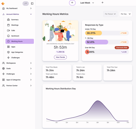
The Working Hours page provides insights into your organization’s work patterns, helping you understand how workdays are evolving. While individual data remains anonymous, these insights give you a sense of whether workdays are becoming longer or more sustainable.
The data can be aggregated on a daily, weekly, monthly, or yearly basis for deeper analysis.
On the Working Hours page, you'll find:
- Average Working Hours
- Understand the typical length of the workday across the organization.
- View total time (average) for the current week, previous week, month, and year, allowing for easy comparisons over time.
-
Ranges
-
View the distribution of working hours among employees.
- See the percentage of users falling within different time ranges, offering insights into varied workday lengths.
-
-
Burnout Risk Calculator
-
Assess the potential impact of extended working hours on employee well-being.
-
Note: The Burnout Risk Calculator provides preliminary insights and should not be the sole indicator of workforce well-being. Wellness involves multiple factors beyond working hours.

Apps
The Apps page provides a detailed and comprehensive view of how apps are being used across your organization. This data is invaluable for understanding how your team spends time in key tools and the financial investment associated with this usage. By identifying trends and patterns in app usage, you can gain insights into tool adoption, engagement, and areas where improvements might be needed.
The data is aggregated at the organizational level to maintain individual privacy while offering a clear picture of overall app usage. You can filter the data by daily, weekly, or monthly timeframes to analyze trends and shifts in app engagement.
On the Apps page, you'll find:
- Key App Insights
At the top of the page, you’ll find three key tiles summarizing app trends:- Top App: The app with the highest usage for the selected timeframe across your organization.
- Biggest Increase: The app with the largest growth in usage compared to the previous period. For example, if you’ve selected a week, it will compare to the previous week.
- Biggest Decrease: The app with the largest drop in usage compared to the previous period.
-
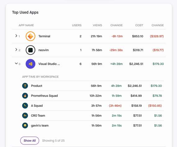
Top Used Apps
Below the key insights, you’ll find a detailed list of the most-used apps within your organization. For each app, the following data is displayed:-
Users: The number of users connected to and actively using the app during the selected timeframe.
- Views: The total duration of interactions with the app, helping you measure engagement.
- Change: Usage trends compared to the previous period, highlighting increases of decreases in app activity.
- Cost: The potential financial cost of App Category usage which is calculated by multiplying the time by the average rate.
- Change: Cost changes compared to the previous period.

-
- App Time by Workspace

App Categories
The App Categories page provides a high-level breakdown of app usage across your organization, grouped into predefined categories. This data helps you understand how time is distributed across different types of tools, offering insights into where your team’s efforts are focused.
The data can be aggregated on a daily, weekly, or monthly basis, allowing you to analyze trends over time.
On the App Categories page, you'll find:
- Donut Chart Summary
- A visual summary of time spent in each category based on the selected timeframe.
- Category Trends Graph
- A graph showing category usage trends over the past 3 months, broken down by week. This provides a historical view of how app usage evolves over time.
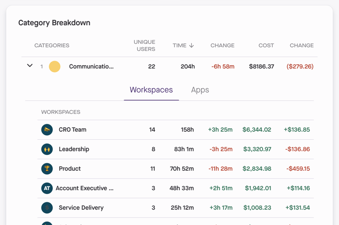
- Category Breakdown
- Unique Users: The number of users who are connected to and utilized each Category within the selected timeframe.
- Time: The total time spent in apps within the category.
- Change: Time changes compared to the previous period.
- Cost: The potential financial cost of App Category usage which is calculated by multiplying the time by the average rate.
- Cost Change: Changes in cost compared to the previous period.

- Category Time by Workspace
Click the arrow next to each category to view a breakdown of its usage by workspace.
From here you can select the Apps Tab within the category to see the specific apps included. For each app, you'll see:
-
Unique Users: The number of users who interacted with the app.
- Time: The total time spent in each app.
- Changes: Changes in app usage time compared to the previous period.
- Cost: The potential financial cost of app usage which is calculated by multiplying the time by the average rate.
- Cost Changes: Changes in app cost compared to the previous period.


-
Challenges
The Challenges page helps you track both active and past challenges at the organizational level. It provides an overview of your team’s participation and progress in various challenges designed to enhance productivity, well-being, and collaboration.
On the Challenges page, you'll find:
Summary of Active Challenges
At the top of the Challenges page, you'll see an overview of all active Challenges within your organization, including:
- Total Active Challenges - The total number of Challenges currently running.
- Total Active Account-Wide Challenges - The number of Challenges that apply to all users automatically.
- Active Public Challenges - The number of Challenges open for anyone in the organization to join, along with the percentage of users participating.
- Active Private Challenges - The number of invite-only Challenges, including the percentage of users participating.
Challenge Insights & Past Challenges
- Each Challenge is represented by a Challenge Card displaying key details, such as Challenge name, duration, and participation rates.
- Clicking on a Challenge Card will take you to the Challenge Details Page, where you can view in-depth information and track progress.
- Past Challenges are listed at the bottom of the page, allowing you to review previous Challenge results and compare trends over time.
