.png?width=688&height=572&name=Heatmap1%20(1).png)
Table of Contents
What are Heatmaps?
Produce8 Timelines and App Metrics already show you what work looks like over a single day or week. That data is important, but often we're what we're really interested in is trends over time for the apps you want to spend time in and those you prefer to avoid.
Heatmaps give you another layer of insights by showing you how you use your work applications on an average day over the last week(s) or month(s).
They are particularly interesting when answering questions like:
⌛ Are your morning and afternoon check-ins with your daily plan actually happening?
⏲️ In which part of the day are you collaborating more? What about the rest of your team?
📧 Are your efforts to batch your email or job applicant screening time paying off?
🔍 Are your efforts at creating focus blocks at a certain time of day working?
❌ When should you avoid booking people for meetings based on when they are usually crushing it?
Accessing Heatmaps
Heatmaps are located wherever you see time series data for app usage. In order to view the Heatmap for any App, you can:
- From your Insights Page within your Dashboard, access the Heatmap for any of Your Top Viewed Apps by clicking the name of the App:

- From any Personal or Shared Workspace, navigate to the sidebar menu on the lefthand side and select the Metrics page, then select Trends next to any app to see its Heatmap:

Insights from Heatmaps
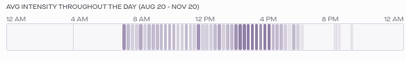
A Heatmap shows you how you use your work applications on an average day over a specific period of time between 1 week and 3 months which select below the chart.
Each bar represents a 15 minute interval in your day where you've historically used the App that the Heatmap belongs to. The darker the shade of the bar, the more frequently you've used that App at that time historically.
This gives great insight into how you usually navigate between tasks and focus through your day. And it's more than descriptive, your historical patterns are good predictors of how you'll use this app in the future - unless you change something! This pattern can help you determine how to plan your day, uncover patterns of focus or distraction, and help you identify opportunities to double down or make adjustments to your intraday work patterns.
![]()
Using Personal Heatmaps
In the example above (which is this author's work pattern for my messaging app), we can see that I frequently check & respond to messages at the beginning of the day, around lunchtime, and then in the afternoon between 2-4pm. From this, I might infer (in conjunction with other data points including a comparison with how I want or expect my days to go) some or all of the following:
- I've done well to batch my communications at the beginning, middle, and end of the day.
- Lower app usage in the morning provides opportunity for focused work between 9am-noon.
- Afternoon peaks for messaging could indicate hours set aside for collaborative work, or it could be a pattern of distraction or even fatigue.
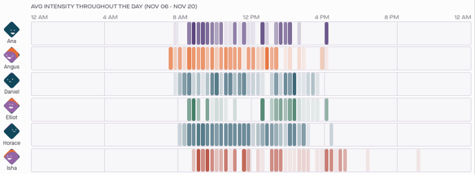
Using Team Heatmaps
Viewing the Heatmap for how your team uses a specific app from a Shared Workspace, can help you identify systemic patterns and as well as help you understand individuals' work patterns.
![]()
Note that you can adjust the timeframe (min. 1 week to max. 3 months) by selecting a different option at the bottom left of the page. You can also select a specific individual by clicking on their name in the list at the right of the chart (not pictured here).
There's a lot that can be inferred from this data, including:
- Identifying times of day that your team works synchronously vs asynchronously by looking for overarching patterns in messaging & meeting tools.
- Recognizing systemic workflow issues that affect the entire team (for example, frequent automated notifications interrupt everyone throughout the day).
- Gaining awareness of your team's individual working styles so that you don't impede their most productive hours with meetings, etc.
- Identifying problematic workflows, or difficulty across the team in following them.
- Exploring whether every team member is able to spend the time needed doing their most important work, and what might be holding them back.
In general, "working out loud" or sharing this data across a team gives your team a powerful tool to understand their work in the context of the patterns of the entire team and provides the insights needed to inform individual, team-wide, and/or organizational changes that can result in better workdays for everyone.