@2x%20(1).png?height=120&name=Produce8%20logo%20-%20Colour%20white%20(L)@2x%20(1).png)
A guide to understanding your Account Metrics and their impact on your business.
The Account Metrics provide you with valuable insights into how the organization spends its time, and breaks down how time is spent across your tech stack and the associated cost for the business as a whole and by team (based on Shared Workspaces).
Table of Contents
- How it Works
- Where to Find Your Account Metrics
- Meetings
- Calls
- Sentiment
- Working Hours
- Apps
- Account Summary Dashboard
How It Works?
The Account Metrics are available to Owners, Admins, and Report User will get aggregated insights (deliberately protecting individual privacy to avoid employee monitoring). The Account Metrics will encompass five essential aspects: Meetings, Calls, Sentiment, Working Hours, and Apps.
Where To Find Your Account Metrics
- Navigate to the Account Metrics page in your Produce8 account by clicking your name at the top-right of the page, then select Account Metrics.
- Once on the Account Metrics page, locate the gear icon, and click on it to access the settings.
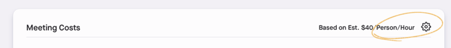
- Within the settings, you'll have the option to input the average salary per user. Enter the appropriate value to ensure accurate cost calculations.
- After inputting the average salary, select Save to apply the changes.
- After inputting the average salary, you can then explore detailed insights into your organization's performance across various metrics such as Meetings, Calls, Sentiment, Working Hours, and Apps. Click on each tab to access specific data points.
Anatomy of Account Metrics
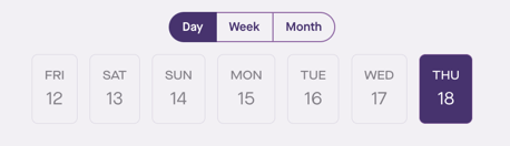
Each of the metrics provide additional context to help you understand how time is spent. All of these metrics can be aggregated daily, weekly, or monthly by selecting the date range on the calendar.
Meetings
Understand the time spent in internal and external meetings across your business, including the nature of the meetings and their implied cost.
The Meetings analytics tab will show you:
-
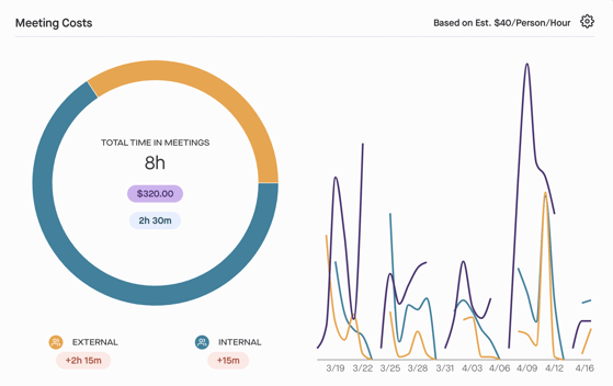
Meeting Costs
- A distribution of total time in External and Internal meeting using a donut chart.
- The total cost based on organization cost settings.
- Increase/decrease in meeting time compared to the previous period for both external and internal meetings.
- The chart on the right displays meeting trends over weekly or monthly periods.
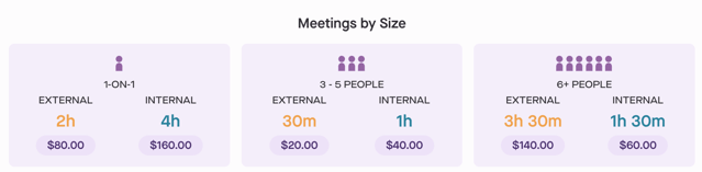
- Meetings by Size
- The distribution of meetings based on the number of people for the selected timeframe.
- Changes in meeting duration and cost compared to the previous period.
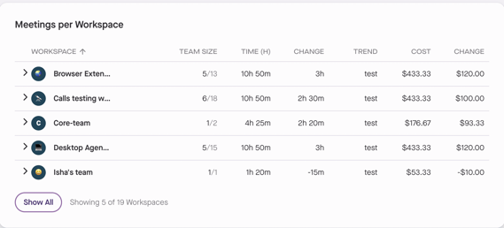
- Meetings per Workspace
- View the breakdown of time in meetings within all public workspaces.
- See the combined time in internal and external meetings in the workspace regardless of their opt-in status.
- Calendar Time by Type
- The bar chart illustrates the breakdown of time in meetings for all days in the selected timeframe.
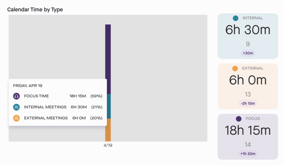
- The bar chart illustrates the breakdown of time in meetings for all days in the selected timeframe.
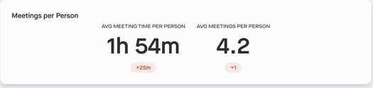
- Meeting per Person
- See the average amount of time each person spends in meetings.
- Displays the average number of meetings each person attends.
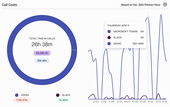
Calls
Your company’s employees spend a lot of time in virtual meetings inside the business and with your customers and partners. Call analytics summarizes all that activity and its financial impact.
The Calls analytics tab will show you:
- Call Costs
- Visualize the distribution of total time in calls in Slack, Microsoft Teams, and Zoom using the donut chart.
- Understand the total cost of calls based on your organization's cost settings.
- View the changes in call durations compared to the previous period for both total time and specific tools.
- View the trend of all calls over the selected timeframe with a chart on the right side. This feature is available for weekly and monthly data.
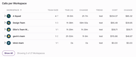
- Calls per Workspace
- View the breakdown of time in calls within all public workspaces.
- See the total time in calls across all collaboration tools for all users within the workspace, regardless of their opt-in status.
- Calls by App
- The bar chart illustrates the distribution of time in calls across all collaboration tools for the selected timeframe.
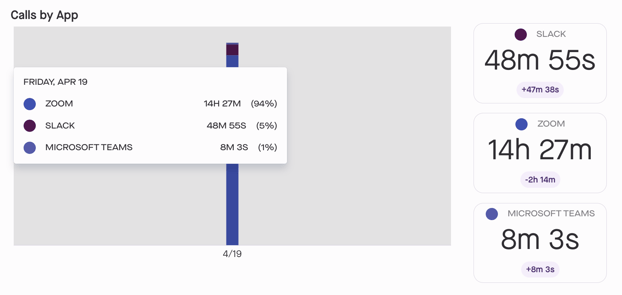
- The bar chart illustrates the distribution of time in calls across all collaboration tools for the selected timeframe.
- Calls per Person
- See the average amount of time each person spends on calls.
- See the average number of calls each person participates in each day.

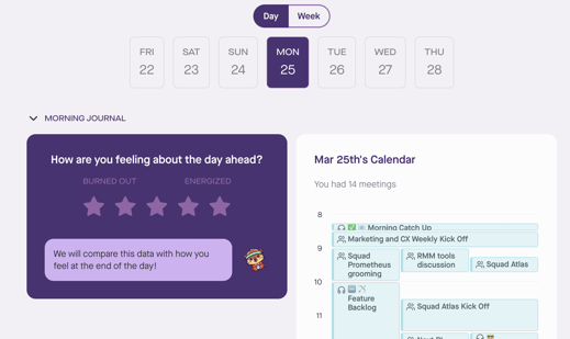
Sentiment
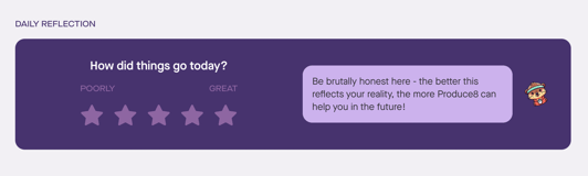
The Sentiment feature helps organizations keep a pulse on how employees are feeling about their workdays in real-time. By sharing your sentiments, you contribute to building a clearer picture of the overall atmosphere within the company.
How It Works
- Morning and Afternoon Reports: You'll receive morning and afternoon notifications to share your perspectives. At 9 am local time, you'll receive a notification to provide a perspective report for the upcoming day, and at 3 pm local time, you'll be reminded to share a retrospective report for the day.
-
Convenient Input Options: You can enter your reports directly from your phone or through the web app. If you miss the notifications, you can still contribute by filling out the report later.
-
Visibility and Privacy: Your responses are completely private and only visible to you. You can even add personal notes to your sentiments for your own reference.
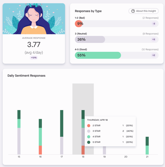
Organization Sentiment
Understanding the overall sentiment of your organization is crucial for gauging employee satisfaction and identifying areas for improvement. While specific individual responses remain private to the users, we summarize how the people in your business feel about their workdays by aggregating their end-of-day responses.
The data can be aggregated on a daily, weekly, or monthly basis.
The Sentiment analytics tab will show you:
-
Breakdown: Users can view the breakdown of ratings by the percentage of users, providing insights into the distribution of sentiment across the organization.
-
Average Sentiment: Gain an understanding of the average sentiment across the organization based on the number of responses received.
-
Average Number of Responses: Gain insight into the average number of responses received, providing an indication of engagement and participation across the organization.
- Response Analysis: Explore the percentage of responses for each rating category and the percentage increase or decrease compared to the overall average value.
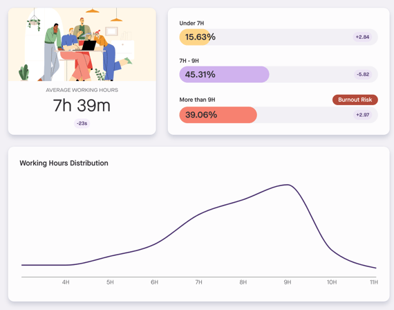
Working Hours
Gain insights into employee work patterns with the Working Hours feature. We do not identify individuals, but working hours should give you a sense that employees are shifting to longer or more sustainable workdays.
The data can be aggregated on a daily, weekly, or monthly basis.
The Working Hours analytics tab will show you:
- Average Working Hours: Understand the typical length of the workday across the organization and see changes compared to previous periods.
- Ranges: View the distribution of working hours among employees, indicating the percentage of users falling within different time ranges.
- Burnout Risk Calculator: This feature assesses the potential impact of long working hours on employee well-being. It's important to note that the Burnout Risk Calculator provides preliminary insights and should not be used as the sole indicator of workforce overwork. Workforce wellness involves multiple factors beyond working hours alone.
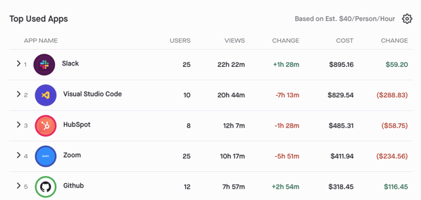
Apps
Explore app usage across your organization. This data, previously available in personal and shared workspaces, is now aggregated company-wide. It provides valuable information on the time spent in each app daily, offering visibility into critical tool usage and the financial investment represented by this time.
The data can be aggregated on a daily, weekly, or monthly basis.
The Apps analytics tab will show you:
- Users: Discover the number of users who utilized each app within the selected timeframe.
- Views: Understand the durations of interactions with each app.
- Change: Compare app usage to the previous period to track trends and identify shifts in usage patterns.
- Cost: Calculate the potential financial investment of app usage by multiplying the views by the average rate.
- Change: Analyze changes compared to the previous period.
- App Time by Workspace: Click the dropdown menu for each app to expand and view the breakdown by workspace.
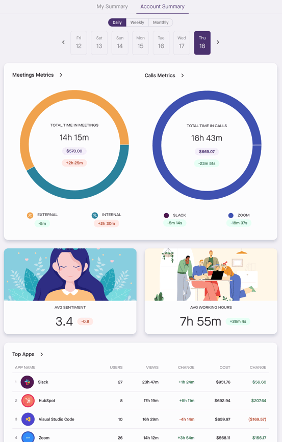
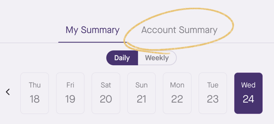
Account Summary Dashboard
In addition to exploring detailed insights into your organization's performance across various metrics, you can also access a new Account Summary tab on your homepage. This data can be aggregated daily, weekly, or monthly.
The following data will be available in the Account Summary Dashboard:
- Total Time in Meetings: Total time in internal and external meetings across the organization.
- Total Time in Calls: Total time in calls in Zoom, Slack, and Microsoft Teams across the organization.
- Average Sentiment: Average sentiment score across all users in the organization.
- Average Working Hours: Average working hours across all users in the organization.
- Top Apps:
- Users who used the app in the selected timeframe.
- Views: Understand the durations of interactions with each app.
- Change: Compare app usage to the previous period.
- Cost: Calculate the potential financial investment of app usage by multiplying the views by the average rate.
- Change: Analyze changes compared to the previous period.
Clicking on any of the components will take you to the detailed view of the report, allowing for deeper analysis and insights into each metric.