@2x%20(1).png?height=120&name=Produce8%20logo%20-%20Colour%20white%20(L)@2x%20(1).png)
Everything you need to know about visualizing your team's work patterns in a Shared Workspace
Once you have created a Shared Workspace, added the Apps that you wish and got your team onboard, you can start to benefit from working out loud together. There are several places within the Shared Workspace where you can gainer deeper insights into your Team's use of technology. Let's dive in!
Timeline
When you first navigate to your Shared Workspace, you will see a Timeline of all the team members App usage. This is a visual representation of your working patterns over the timeframe you define (hours, days, or weeks). The Timeline has three swim-lanes: Views, Calls, and Calendar.
- Views: The top lane illustrates your typical activities. Look for patterns that represent specific workflows, distractions, focus time, and healthy breaks & offline activities.
- Calls: Directly below this swim-lane, visually represents your time spent in Zoom, Slack, and Microsoft Teams calls, huddles, and meetings.
-
Calendar: The bottom lane displays both past and planned calendar entries, facilitating comparison between scheduled events and actually occurrences.
When Views and Calls overlap, it indicates that the individual is interacting with other tools while on a call. This overlap could signify various scenarios such as screen sharing and presenting, or multitasking with other work tools during a meeting.
The swim-lanes help you contextualize your workday activities, enabling you to identify focused sessions, brief distractions, or multitasking instances.
The Timeline can be used to identify different working patterns within your team and help to shape collaboration.
Data will show for the Apps that each Team Member has accepted to share data from.

On the right hand side, you will see a list of Apps used by your team. By clicking on a specific App, you can focus on that App's usage for that day. See below example for Slack:
 You can also select the ellipsis (...) on the right hand side and toggle on Show Categories to filter the Timeline by App Category.
For more information on Categories, read here.
You can modify the time period you are looking at by using the date picker at the top. You can view the data by days or weeks.

Workspace Metrics
Clicking the Metrics tab at the top of the Shared Workspace brings you to the below screen. Metrics illustrates the amount of time that your team has spent in the Apps that your Workspace follows.
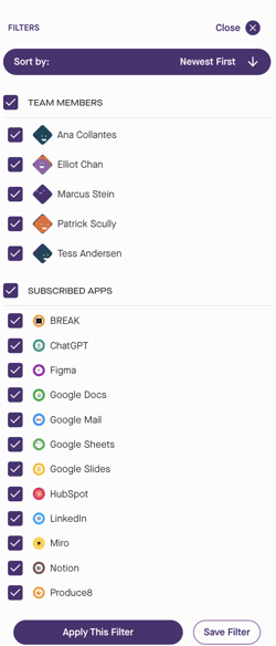
Filters
Use the Date Selector and Filters to choose the timeframe for the metrics displayed below:
- Date Selector - choose between daily or weekly view and review current or historical data that falls within your accounts data retention window.
- View Data For - you can toggle between your Team's grand totals or averages per person, or use the Pick a Team Member filter to see an individual total.

Scheduled Time in Meetings
The donut chart for Scheduled Time in Meetings will display the following:
- The total time spent in both internal and external meetings for all members of the Shared Workspace.
- A count of internal and external meetings that occured within the workspace.
- Difference in duration from the previous period.

Time in Calls
The donut chart for Time in Calls will display the following:
- The total time spent in calls for apps like Zoom, Slack, and Microsoft Teams where the direct integration is set up.
- A count of calls that occured within the workspace.
- Difference in duration from the previous period.

App Categories
 The App Category metrics will provide you with a donut chart summary to show you a breakdown of time spent in each category based on the selected timeframe.
Hover over the chart to see which Category each color pertains to as well as the time that your team spent in each Category.
Besides the donut chart for App Categories you will see the the table listing the breakdown which will include:
- Time: The total time spent in the apps that are in each defined Category.
- Change: The difference from the average from the previous selected time frame. For example, if viewing weekly, it will compare against the previous week.
- Trends: Click on any of the Trends for the Categories to delve into the Time Series to analyze daily and weekly trends and your average use of the Apps in each Category.
Donut Chart Summary

The donut chart summary shows the proportion of the day that each App was used. This chart gives you a quick overview of the overall distribution of your team's time across their work apps as well as the number of interactions that occurred with each app.
Hover over the chart to see which app each colour pertains to as well as the time spent in each app or the number of interactions.
Top Apps
Underneath the Metrics, you will see the Apps that are most used by your team. The data you will be given is:
- Total time spent in each app.
- Total number of views (interactions) with each app.
- Difference from the previous period selected.
- Average of the time of each interaction with each app.
Top Apps can be used to identify whether you and your team are working effectively in the Apps that matter most to your work.

By clicking the arrow next to each App you will see: which Data Source the activity for that App has come from, views (number interactions), total time (time in calls/time in App), and avg duration.
Click on any of the Trends for the Top Apps to delve into the Time Series and Intensity Heatmap view so you can analyze daily and weekly trends and your average use of the app in question across different days respectively. This data-driven approach empowers you to manage your app usage effectively so that your days go the way you want.
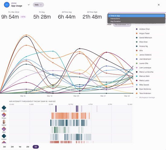
Use the various controls to view the following options:
- Scope - use the dropdown at the top left to toggle between weekly and daily totals or look at totals for a specific day of the week.
- View - the dropdown at the top right lets you choose between viewing the team total or average per person.
- Time Frame - choose the time frame (min. 1 week to max. 3 months) at the bottom left.
If you are Zoom, Slack, or Microsoft Teams is one of your Top Apps, you can view the time you spent in Calls by selecting the Calls tab. You can switch between Time in Calls, Call Interactions, and Avg Call Duration. 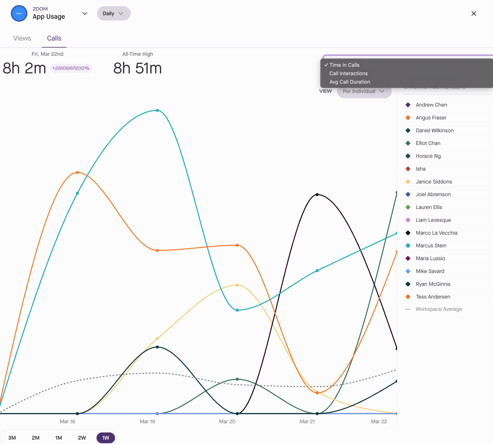
Activities
Selecting the Activities tab within the Shared Workspace opens up a list of each of your Team's Activities with their Apps in real time.
In addition to listing individual activities, the Activity stream includes real-time "On a Call" statuses while in a virtual meeting in Slack, Zoom, or Microsoft Teams. In a shared workspace, this status is viewable for anyone on the team.
Activities helps to give a holistic view of everything that has happened within your Teams Workday. Here you will see the App's that were visited and the duration of each of the sessions.

You can filter this information by individual and by App. For example, if you were to view Slack, you could see all the activities each team member has had in Slack. If there are many short interactions this may suggest that they have been distracted from focused work.