When you sign in to Produce8, you'll land on Your Dashboard - your private space to explore your work habits, identify opportunities to optimize your day, and take control of your time.
Your Dashboard consists of two key areas:
- Insights: A summary view of your key work metrics and Personal Insights.
- Timeline & Activities: A visual representation of how your navigate through your workday, and a list of your activities in each App as it happens.
Insights Page
The Insights Page is here you'll land by default when you open Produce8. It's a personalized and private summary of your workday, designed to give you valuable insights at a glance.
What You'll Find on the Insights Page:
-
Morning Journal: Contribute to building a clearer picture of the overall atmosphere within the company by sharing your sentiments about your workday.
-
Time Breakdown: Gain insights into how your workday was divided across four key metrics.
-
Personal Insights: Deep dive into metrics that reveal patterns and opportunities to improve your focus and efficiency.
-
Challenges: Measure the impact of changes you make within the organization, offering a clear picture of what's working and what might need adjustment.
-
Goals: Set targets for App Usage, Personal Insights, and specific time-related objectives to help you stay on track.
-
Top Apps Summary: See where you’re spending most of your time by reviewing app usage.
-
Top App Categories: Get a clearer picture of where you are spending your time by viewing your breakdown of time spent in each category.

In order to make use of these insights, you need to ensure that you've connected your Produce8 account to the apps that you use for work.
In order for the Personal Insights and Top Apps report to generate, you need to have accumulated at least 30 mins of activity in connected work apps for that day.
Beyond that, the better your data sources, the more accurate the insights we can provide. That is, they'll be most accurate when you've connected to most or all of the applications that you use for work.
Morning Journal
Sentiment helps organizations keep a pulse on how employees are feeling about their workdays in real-time.
You can access your Morning Journal from your Insights Homepage by:
- Selecting Let's go underneath the Morning Check-In.

- On the next screen your calendar for the upcoming day will be displayed. Select Next at the bottom of the screen.
- You will then have any active Challenges displayed to you as well as your current status within the Challenge. Select Next at the bottom of the screen.
- You will then be asked to submit a response for how you are feeling about the day ahead. On a scale of 1-5. Select Next to submit.
- On the next screen, select Finish to complete.

- If you have mobile notifications turned on you'll receive a notification at 9am local time to share your perspective report for the upcoming day.
- Your responses are completely private and only visible to you. You can even add personal notes to your sentiments for your own reference.
Time Breakdown
Your Time Breakdown provides a summary of how your day was spent, allowing you to see patterns, and see trends in how you work.

These insights take all of the activity data from the applications that you follow and compile them into 4 key metrics: Digital Working Hours, Time In Apps, Time In Calls, and Scheduled Meetings. There's no ideal "score" for these insights; we leave it to you to decide what the optimum values are for your role and working style.
For a detailed look at how these Insights are calculated, click here.
By default, when you visit this page, you'll see the insights for the current day. You can use the Date Picker to navigate to past dates and toggle between daily and weekly metrics.

In addition, click on any score to unlock a more detailed Time Series and view. Explore daily and weekly trends and to look at the trends for a specific day of the week (ie. Mondays). This information enables you visualize patterns and how they're changing over time. 
The Digital Working Hours Time Series view includes your Working Sessions over the previous 7 days. A working session is the time you spend actively working without long breaks. If you step away for 60 minutes or more with no activity, the session automatically ends.
Personal Insights
Your Personal Insights provides a high-level summary of your work patterns, making it easy to spot trends and comparisons. 
These insights distill activity data from the applications you follow into two key metrics: Focus Score and Digital Intensity. You can use these metrics to understand your productivity levels and make adjustments to your workflow.
For a detailed look at how these Insights are calculated, click here.
By default, you'll see insights for the current day, but you can use the Date Picker to explore past dates and toggle between daily and weekly metrics. 
In addition, click on any score to unlock a more detailed Time Series and view. Explore daily and weekly trends and to look at the trends for a specific day of the week (ie. Mondays). This information enables you visualize patterns and how they're changing over time.

The Focus Score Time Series view includes your Working Sessions over the previous 7 days. A working session is the time you spend actively working without long breaks. If you step away for 60 minutes or more with no activity, the session automatically ends.
Goals
Personal Goals is available for all Produce8 customers for a limited time; however, it will soon become a feature of Produce8's PRO plan.
Click here to see all the other benefits of Produce8 PRO.
Personal Goals help you take charge of your workday and create a productive & healthy routine. Whether you aim to minimize distractions, improve digital wellbeing, or elevate your work output, Personal Goals are your tool for success.
The Produce8 Homepage serves as a "snapshot" of your goal metrics. When you first navigate to this page, you'll find today's value, the percentage difference from your goal, and the goal value.
From here, you can use the Date Picker to get a snapshot of your work patterns, Insights, and Goals and toggle between Daily and Weekly Views.
For more information on Goals please see here.

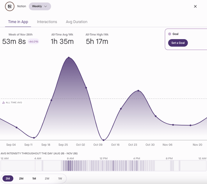
Top Apps
Ever wondered which apps occupy most of your work hours? The Top Apps feature displays the top five applications you use daily, along with the time of your usage.
You probably already have an idea of which applications represent your best or more impactful work. Use this report to understand the difference between how much time you'd like to spend in your top tools vs. how much you actually do. This is a key step towards identifying inefficient workflows & systems, and distractions that may be holding you back from your most important work.

Click on any of the Top Apps to delve into the Time Series and Intensity Heatmap view so you can analyze daily and weekly trends and your average use of the app in question across different days respectively. This data-driven approach empowers you to manage your app usage effectively so that your days go the way you want.
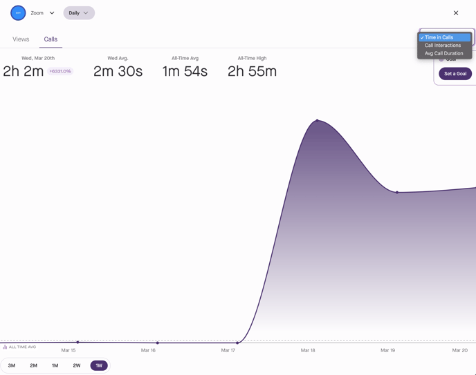
If Zoom, Slack, or Microsoft Teams is one of your Top Apps, you can view the time you spent in Calls by selecting the Calls tab. You can switch between Time in Calls, Call Interactions, and Avg Call Duration.
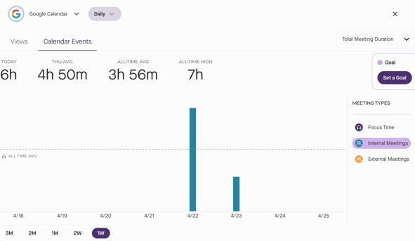
If Google Calendar or Microsoft Outlook is one of your Top Apps, you can view the time spent in meetings by select the Calendar Events tab.
The graphs will how sum total of Focus Time, Internal Meetings, and External Meetings.
You can switch between Total Meeting Duration, Total Meetings, and Average Meeting Duration.
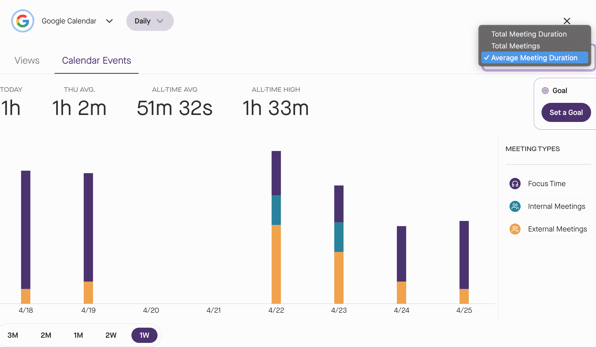
You can filter by meeting type by selecting Focus Time, Internal Meetings, or External Meetings.
Top App Categories
In addition to individual apps, understanding which categories of apps occupy most of your work hours is crucial. The Top App Categories feature displays the top app categories you use daily, along with the time spent in each category.
By viewing the Top App Categories, you can understand where the majority of you time is being spent. 
Click on any of the category names to open up the Time Series of the category. This allows you to delve into the daily and weekly trends, as well as the average use of that category across different days.
Timeline & Activities Page
The Timeline & Activities Page offers a private, detailed view of your workday.
What You’ll Find on the Timeline & Activities Page:
- Personal Timeline: A visual representation of how you navigate through your workday, showing your interactions with apps, focus periods, and breaks.
- Activities Feed: A detailed list of your activities in each app as they happen, helping you identify patterns and areas for improvement.

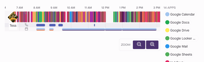
Personal Timeline
Your Timeline visually encapsulates your entire work journey, offering a comprehensive overview of all of the activity from the work applications that you follow over a specific time period. It consists of three swim-lanes: Views, Calls, and Calendar.
The top swim-lane displays your Views, illustrating your typical activities. Look for patterns that represent specific workflows, distractions, focus time, and healthy breaks & offline activities.
Directly below is the Calls swim-lane, providing a visual representation of your time spent in Zoom, Slack, and Microsoft Teams calls, huddles, and meetings.
The bottom swim-lane is the Calendar, which displays both past and planned calendar entries, allowing comparison between scheduled events and actual occurrences. For instance, examining a scheduled internal meeting on Zoom reveals if you were on the call for longer or shorter than expected.
When Views and Calls overlap, it indicates that you are interacting with other tools while on a call. This overlap could signify various scenarios such as screen sharing and presenting, or multitasking with other work tools during a meeting.
These swim-lanes help contextualize your calls within your overall workday and enable you to distinguish between focused sessions, brief distractions, or multitasking scenarios.
Use the Date Picker and Zoom to visualize any time period between one hour and one week on your Timeline. You can also use the App/Category Filter, to hone in on specific apps and workflows by clicking on the app name next to the Timeline. Or by selecting the ellipsis (...) you can easily toggle on Show Categories to filter your Timeline by App Category, enabling you to combine a series of interactions across multiple apps into a single task. This consolidated view of your activities provides you with a clearer view of how much time you've spent on a task.

Below your Timeline you will find:
- Activities Feed: A detailed list of your activities in each App, including session duration, date, and time.
- App Filter: Easily narrow down your your view by selecting one or more specific app.

For a detailed look into these insights, click here.